Acmedelavie (ADLV) Website Improvement

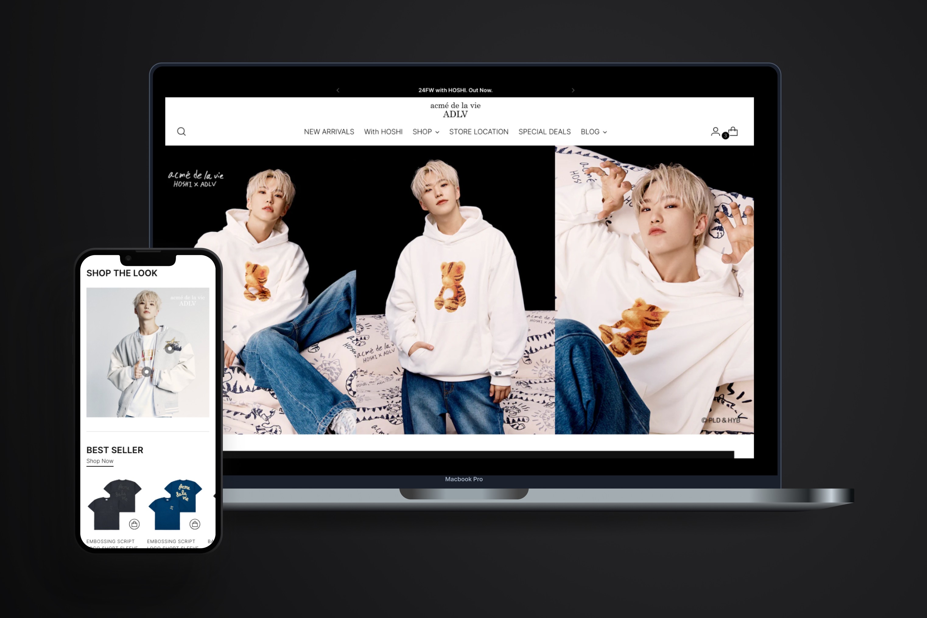
Acmedelavie (ADLV) is a Korean streetwear brand and It is now available in Indonesia under Buka fashion retail. Achmadelavie.co.id using Shopify website, then team asked to improve our homepage more aesthetic because the revenue is quite low compared to Marketplace (like shopee, tokopedia). assuming that by improving our homepage the revenue will also increase.

Visit live website here acmedelavie.co.id

Challenges

We lack of information why many users buy on the marketplace instead of our website, and I doubt that the aesthetic can solve the problem why our revenue is a quite low so, before jump into the solutions, I discuss with my manager first and here's my plan:

  1. 1-on-1 Discussion with My Manager: Start by discussing the project and raising concerns to ensure the project goals. During this step, we agreed to aligning with stakeholder first to share our concern.


  2. Stakeholder Alignment: Meet with stakeholders to align on the project’s goals and share our concerns. If the goal is simply to make the website more aesthetically pleasing, we won’t need to involve the research team, and the current plan can proceed as is. However, if the goal is to increase revenue, the plan needs to change, requiring user surveys and research input.


  3. Finalize the Plan: After aligning with stakeholders, they want to increase revenue. they understood our concerns and agreed to the new plan to involve researcher team and the timeline will adjusted also.

Company

Company

Bukalapak

Industry

Industry

E-commerce Fashion

Website Launched

Website Launched

2024

Tools

Tools

Figma

Shopify

Miro (Brainstroming)

Understanding

First step we look the funnel on the ADLV website, but for the past few months, ADLV’s website have an increasing upper funnel but our conversion to lower funner is decreasing, collaborate with Researcher to pinpoint the reason of the CVR decrease especially in ADLV’s website.

First step we look the funnel on the ADLV website, but for the past few months, ADLV’s website have an increasing upper funnel but our conversion to lower funner is decreasing, collaborate with Researcher to pinpoint the reason of the CVR decrease especially in ADLV’s website.

My Role

  • Work closely with Researcher doing some UX Audit, get insight from clarity(heatmaps tool), benchmarking process and to be a thinking partner.

  • Work closely with business team, marketing team and product team to aligning the project

  • Led the meeting when design checkpoint

  • Work closely with Researcher doing some UX Audit, get insight from clarity(heatmaps tool), benchmarking process and to be a thinking partner.

  • Work closely with business team, marketing team and product team to aligning the project

  • Led the meeting when design checkpoint

Research

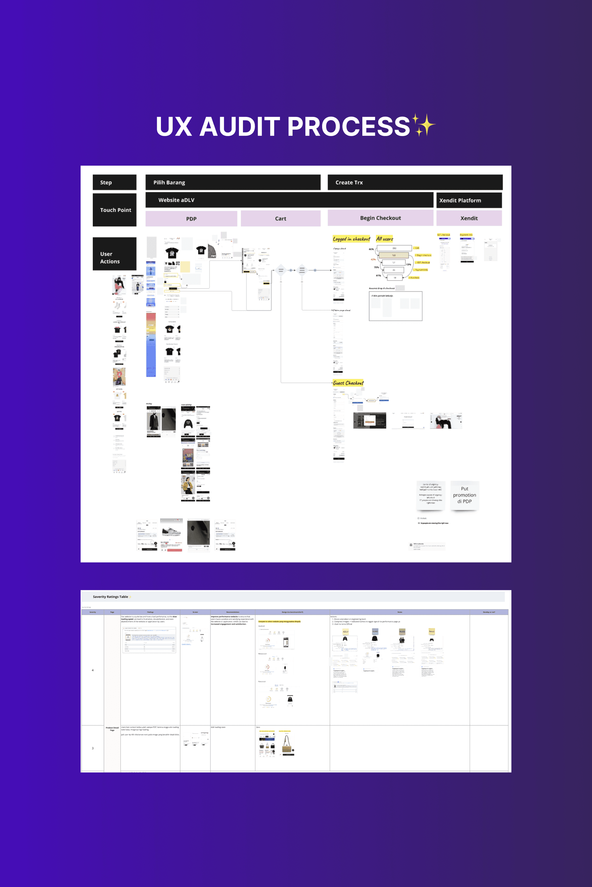
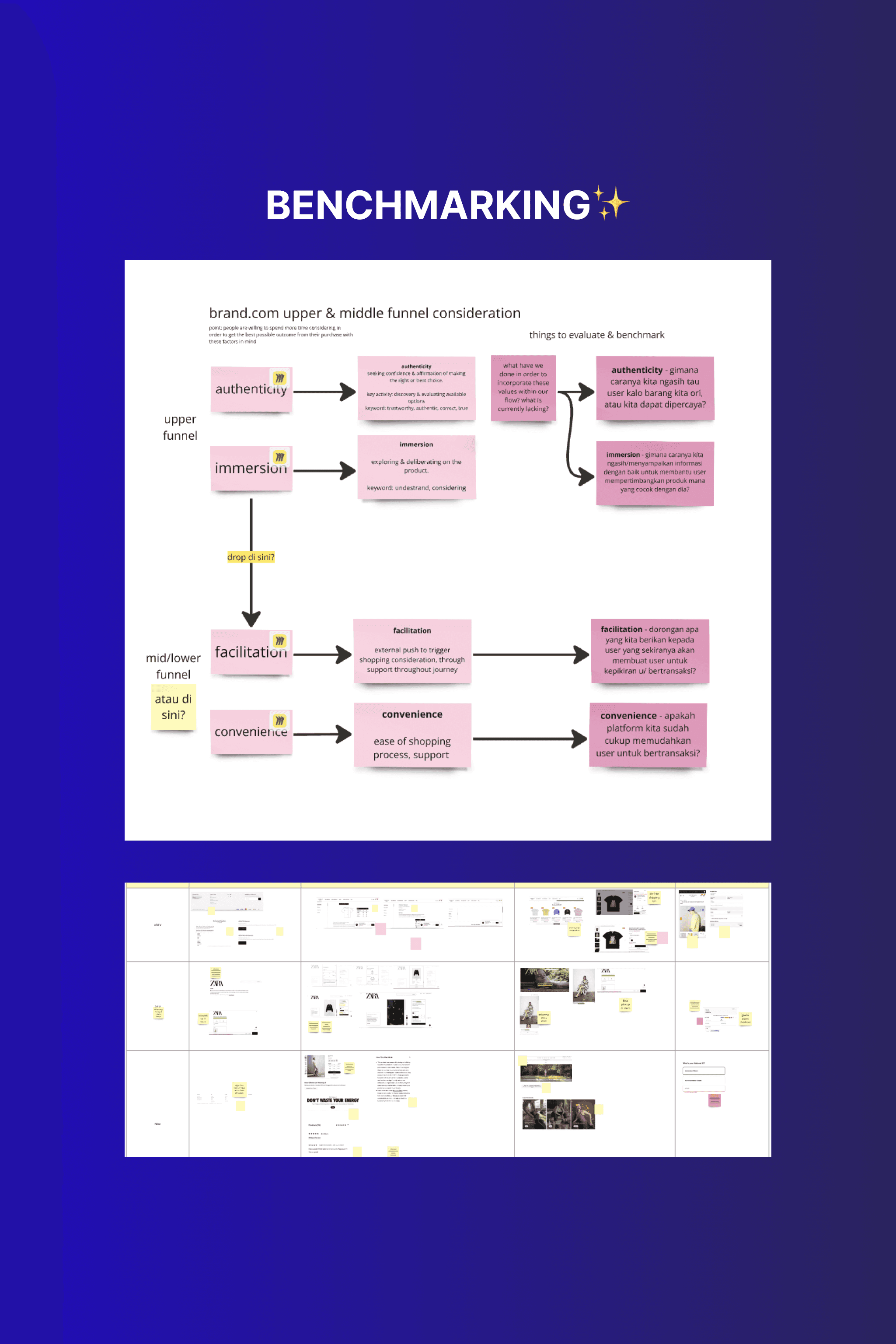
Check Heatmpas & UX Audit

Because the decrease from lower funnel, then we focused the UX audit from that, The first thing, I see the data from heatmaps (We used clarity tools). After looking at the data many users drop off in our product detail page because our website is too slow and somehow the product picture does not appear. After I tried by ourself what users feel by UX Audit, I find some usability issue in our website, then the issue we prioritize by saverity rating, you can check more about the severity rating by nngroup in here, here are the findings prioritized from high to low:

1. Website Performance Issues
Our website has significantly low performance, with a Google Speed score of only 9% out of 100%. This negatively impacts the user experience and overall functionality.

2. Lack of Loading Indicators
The website lacks loading indicators while pages are loading, leading to a poor user experience. This causes users to encounter dead clicks.

3. Information Architecture on the Product Detail Page
Important information on the product detail page is located below the fold, making it hard for users to find. Critical actions, such as the "Add to Cart" button, require users to scroll down.

4. Order Creation Issue
Orders are not created when the payment status is pending, which may make users feel uncertain about the security of their purchase.

After do some UX Audit we can immediatly fix point 1 because is not an assumption, but for points 2-4 we need to make sure on user survey, it's really important to users or not.

Blast user survey

After getting several findings from the UX Audit, the Research team blasted the user survey to understand the user's behavior and why they buy on the marketplace instead. We also asked the questions whats the important info they are looking for if they visit our website, and answer our assumption in UX Audit findings.

After getting several findings from the UX Audit, the Research team blasted the user survey to understand the user's behavior and why they buy on the marketplace instead. We also asked the questions whats the important info they are looking for if they visit our website, and answer our assumption in UX Audit findings.

Recommendations

Benchmark competitors to gather insights and evaluate our website. Based on our benchmakrinng we currently have yet to possess any outstanding feature or service compared to marketplace or even similar website and we plan to highlight voucher nudges checkout/in cart. after get the result of user survey evantually platform is not necessarily the issue why users buy on the marketplace instead, however we can still improve our website for user shop conveniently through our webstore, and here's our recommendations:

  1. Fixing website performance and changes the template design on Shopify

  2. Revamp the Information Architecture(IA) on PDP for important info put in above the fold

  3. Revisit flow purchase journey through website and make consistent for login flow and order can created as well.

See Figma here

Result

60%

Improved performance website

>50%

Increase CVR from product detail to ATC (Add to Cart) by next month.

>20%

Increase CVR from homepage to product detail in three month.

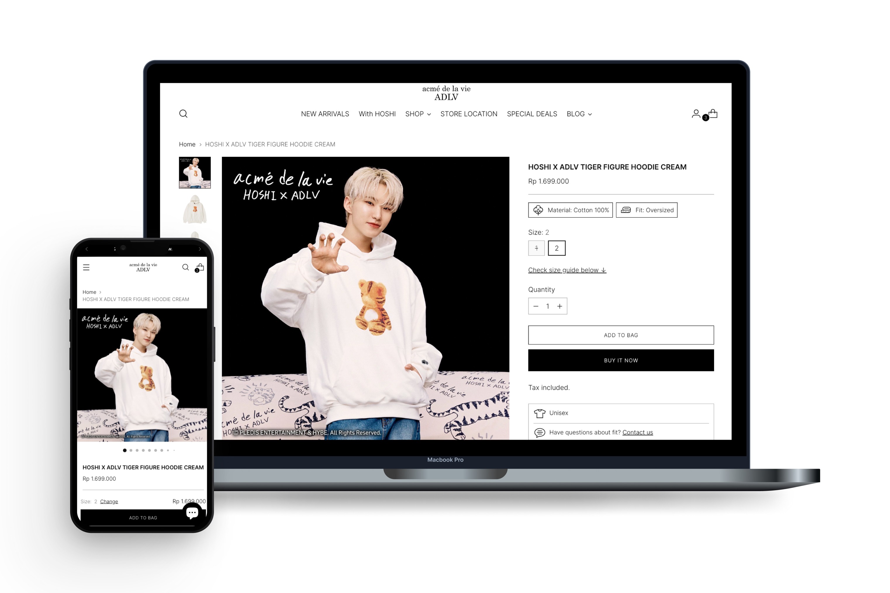
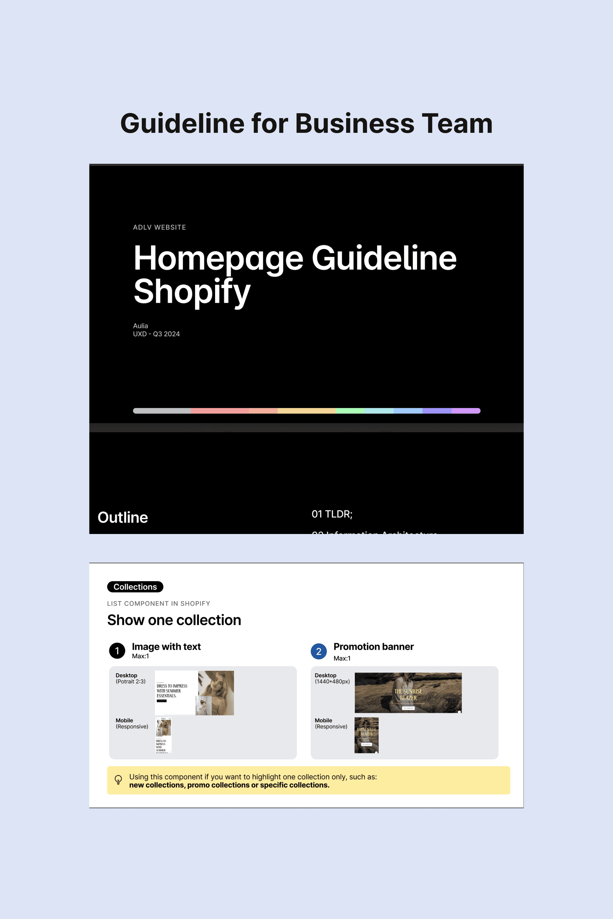
Create Style Guide & Template

I also create a document that marketing design can provide the new visual banner and SEO team can make an content for the new website and also create the guideline to provide flexibility for the business team to customize the layout as needed.

I also create a document that marketing design can provide the new visual banner and SEO team can make an content for the new website and also create the guideline to provide flexibility for the business team to customize the layout as needed.

"With our new design template for the ADLV website, the design is clean and beautiful. I really like it compared to the previous one, and the checkout process is much easier to navigate."

Yenisa

Business Team | ADLV

Conclusion

The Acmedelavie webstore improvements successfully addressed usability issues, creating a more intuitive and user-friendly experience. The updated design, featuring a new template, led to improved website performance, more than 60% higher conversion rates >50%, and better fulfillment of user needs.

The Acmedelavie webstore improvements successfully addressed usability issues, creating a more intuitive and user-friendly experience. The updated design, featuring a new template, led to improved website performance, more than 60% higher conversion rates >50%, and better fulfillment of user needs.

I'am Aulia

Product Designer from Indonesia

Aulia © 2024

I'am Aulia

Product Designer from Indonesia

Aulia © 2024

I'am Aulia

Product Designer from Indonesia

Aulia © 2024