Best for Less Design System
Best for Less is a bazaar/discount store concept that will redefine Bukalapak Marketplace, focusing on the 1P model with the majority of products sourced from our own 1P stores.
In Best for Less, we wanted to introduce a fresh and more playful design approach, because the target audience is moslty young women. Meanwhile, most of Bukalapak's existing users are mostly male. That’s why we decided to create something new and more engaging with a different design style.
See the design here
Bukalapak
Launched
2024
Tools
Figma
Alignment
Challanges


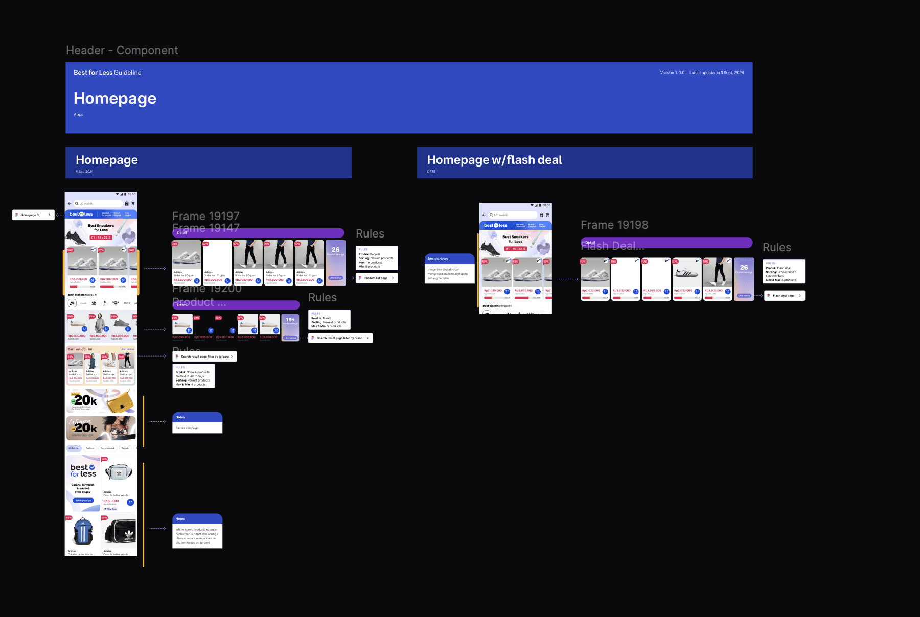
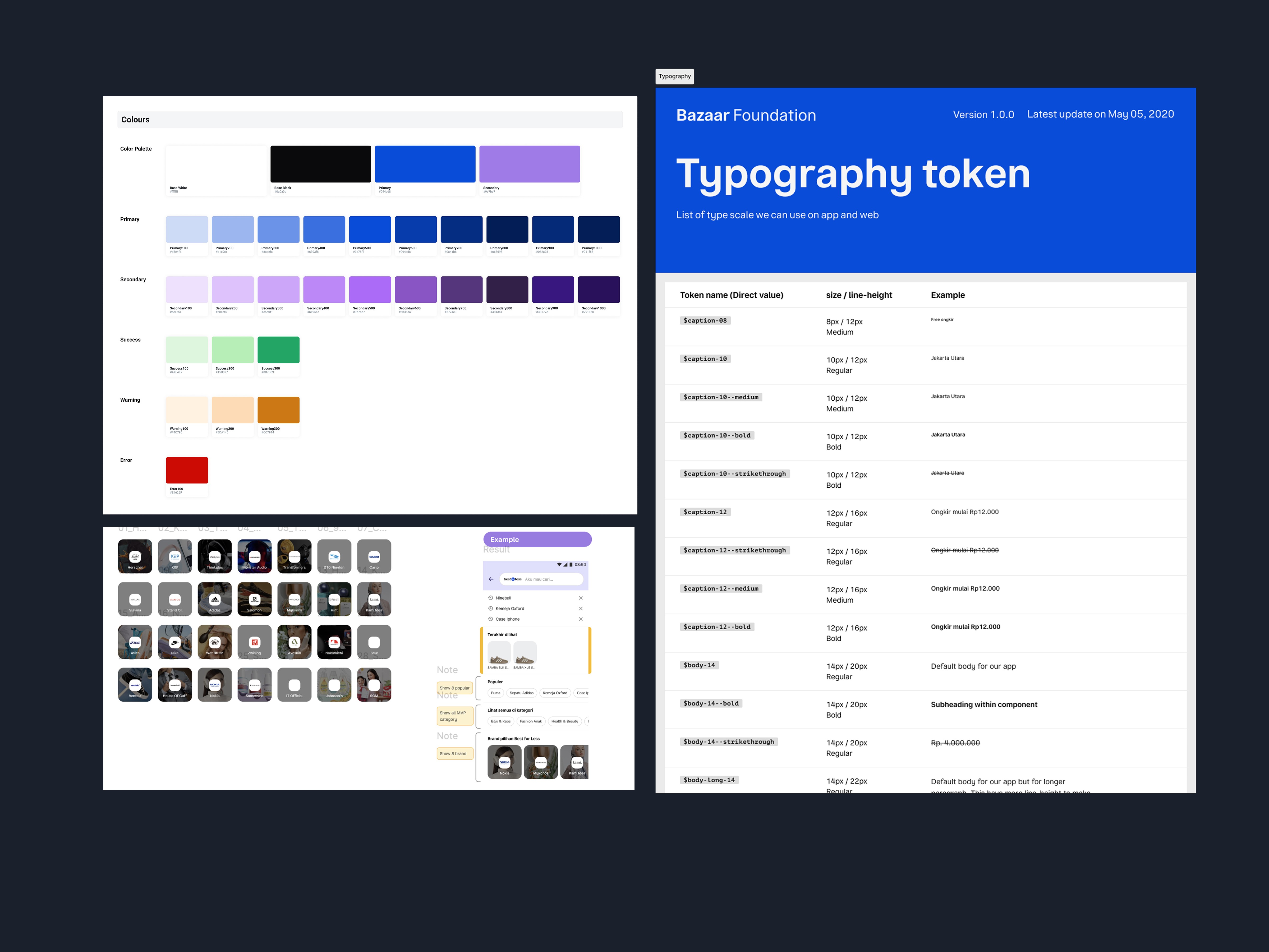
Build Token for Design Library
See the design here
Create component
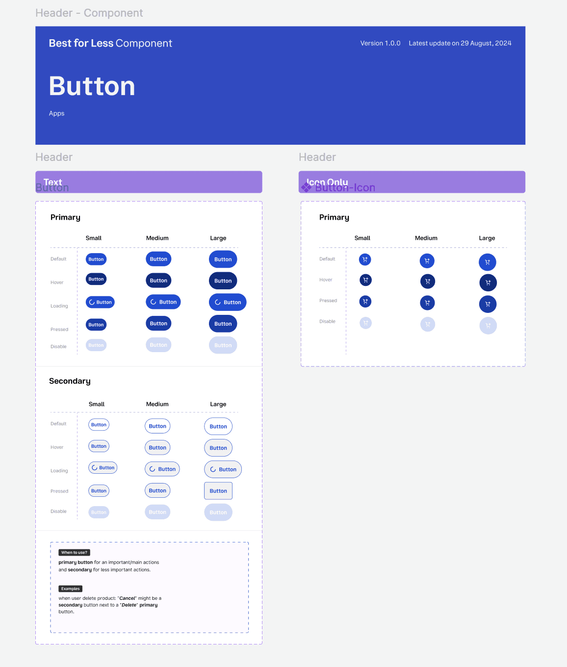
Button
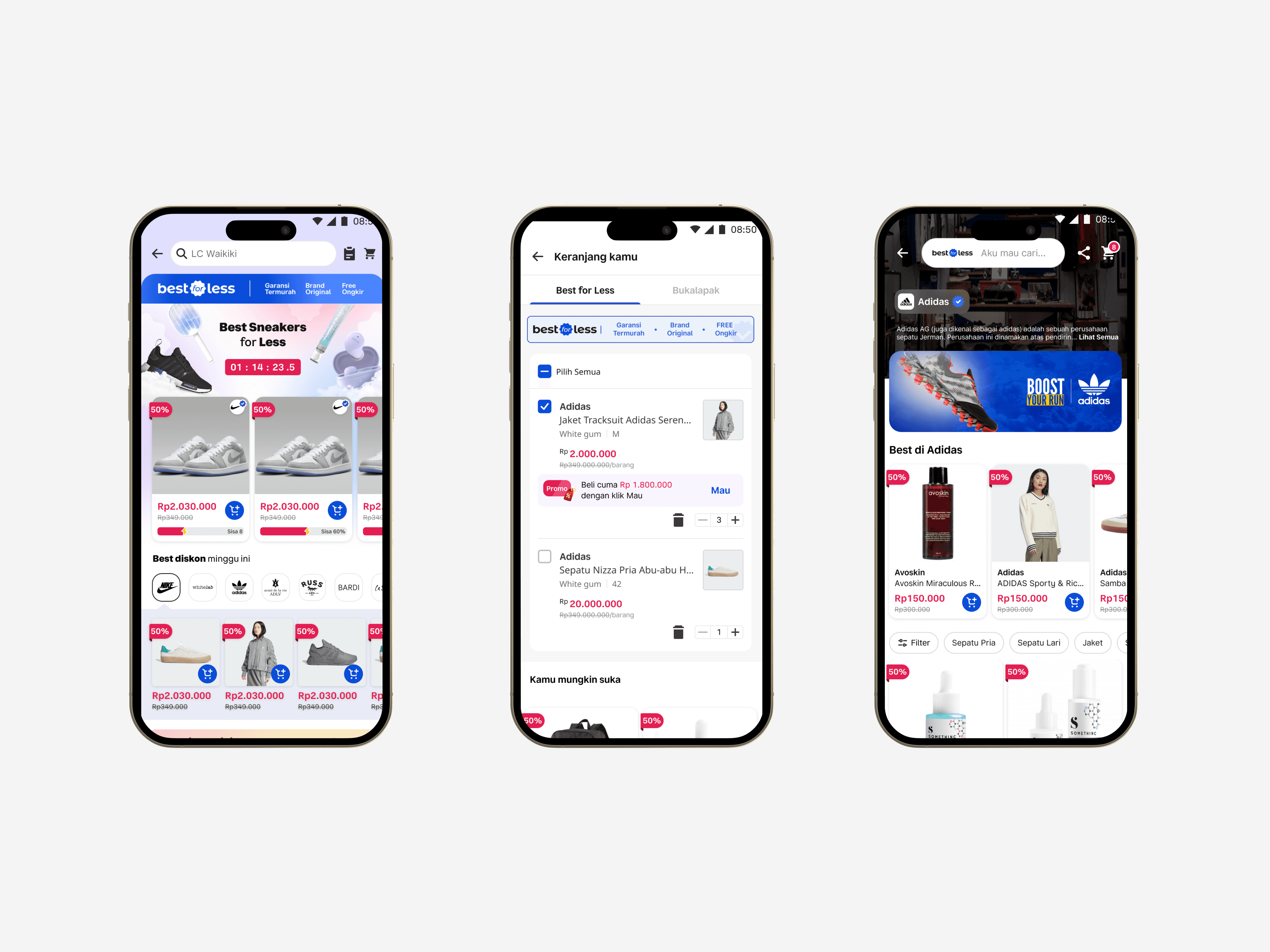
I created button components with all the necessary states to make sure they work well in different scenarios. This included default, hover, pressed, disabled, and loading states. I also made sure the buttons were flexible enough to support different text or icon only—so they could be reused easily across the product without needing to redesign them each time.
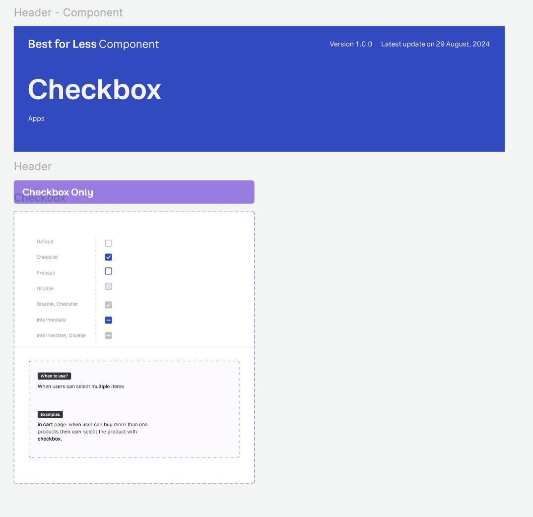
Checkbox
I also designed the checkbox component, covering all its states—unchecked, checked, disabled, and error. But I didn’t stop at just the visuals. I documented when and why to use a checkbox, including examples of common use cases
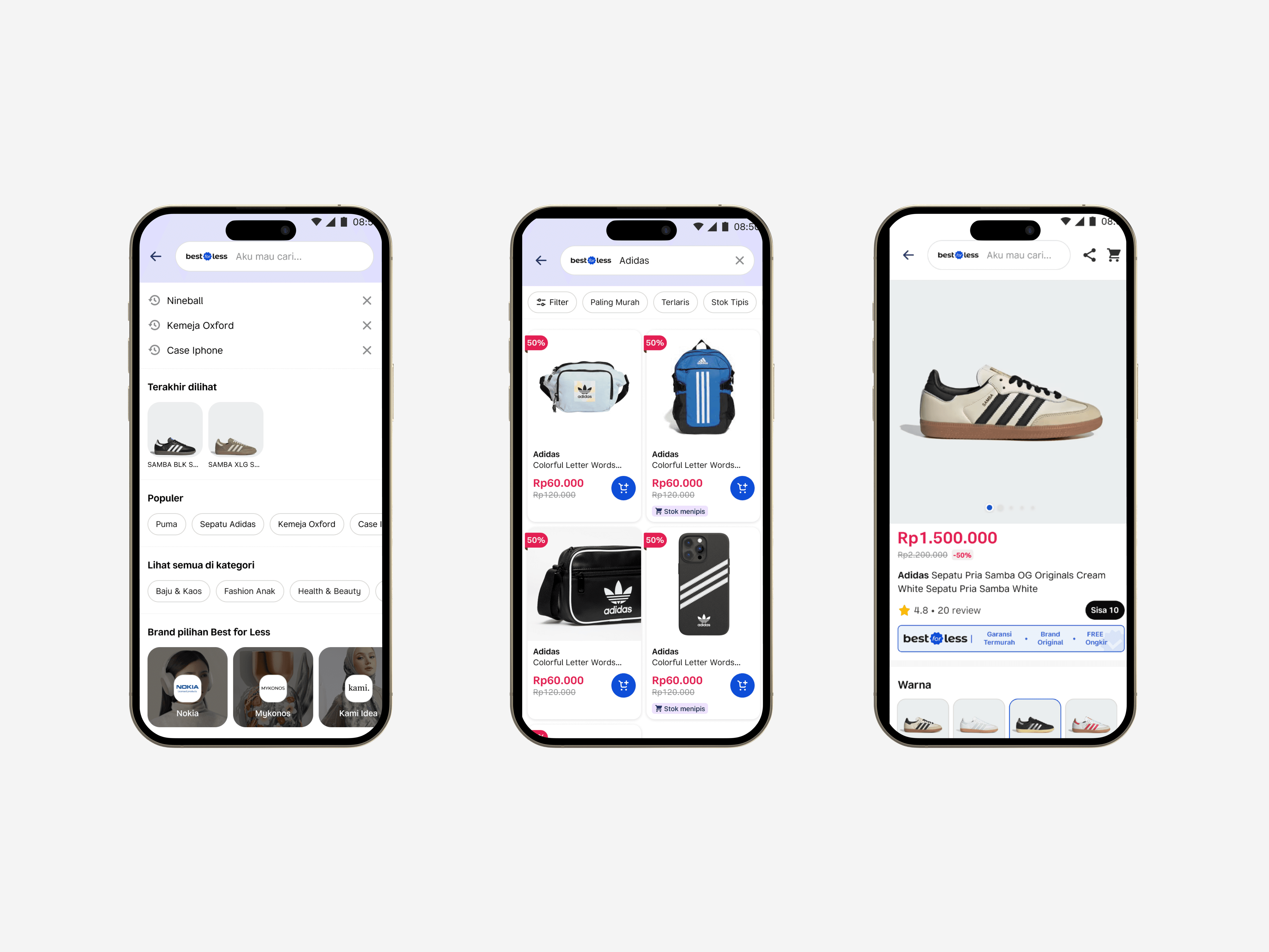
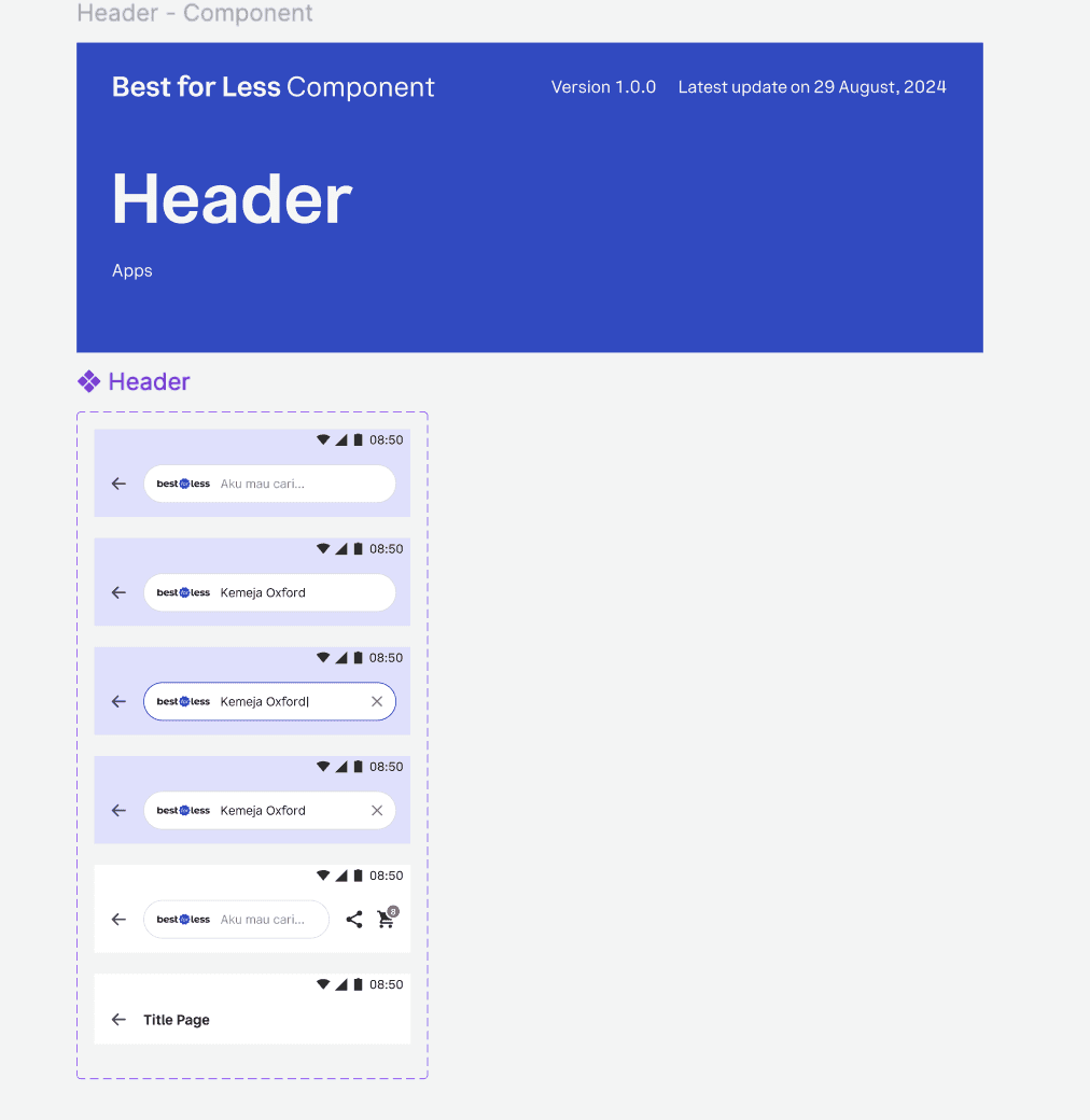
Header
Because Best for Less uses a different header style compared to the main Bukalapak app, I created a dedicated header component. This made it easier for the team to identify and manage different header states—such as default, with search, with back button, or with filter options—ensuring consistency and reducing confusion during development.